Choo - Mobile UI/UX
Category
UI/UX & Branding
/
/
Reimagining public transport through branding and digital experiences that help commuters navigate crowded trains, service disruptions, and daily journeys with greater confidence and ease.

About the Brand
Choo is a transport companion designed to make everyday commuting feel less stressful and more enjoyable. Inspired by the small frustrations of public transport, Choo combines real-time travel information with a playful and approachable personality to support commuters throughout their journey.
Built for daily train and bus users, Choo transforms complex transport information into simple, actionable insights—from arrival timings and seat availability to crowd levels and service disruptions. By balancing utility with warmth, the experience feels less like a transport tool and more like a helpful travel buddy.
Commuting Made Friendlier
The vision behind Choo was to rethink how people experience public transport. Rather than focusing solely on efficiency, the project explores how branding and digital experiences can reduce uncertainty, encourage confidence, and make everyday journeys feel a little more human.


Friendly by Design
Most transport applications prioritise efficiency, often resulting in interfaces that feel cold and transactional. Choo takes a different approach by introducing a playful visual identity inspired by the familiarity of a travel companion.
Rounded forms, expressive illustrations, and warm colours soften the experience while maintaining clarity, helping transport information feel more approachable and engaging.
Designing Around Commuter Behaviour
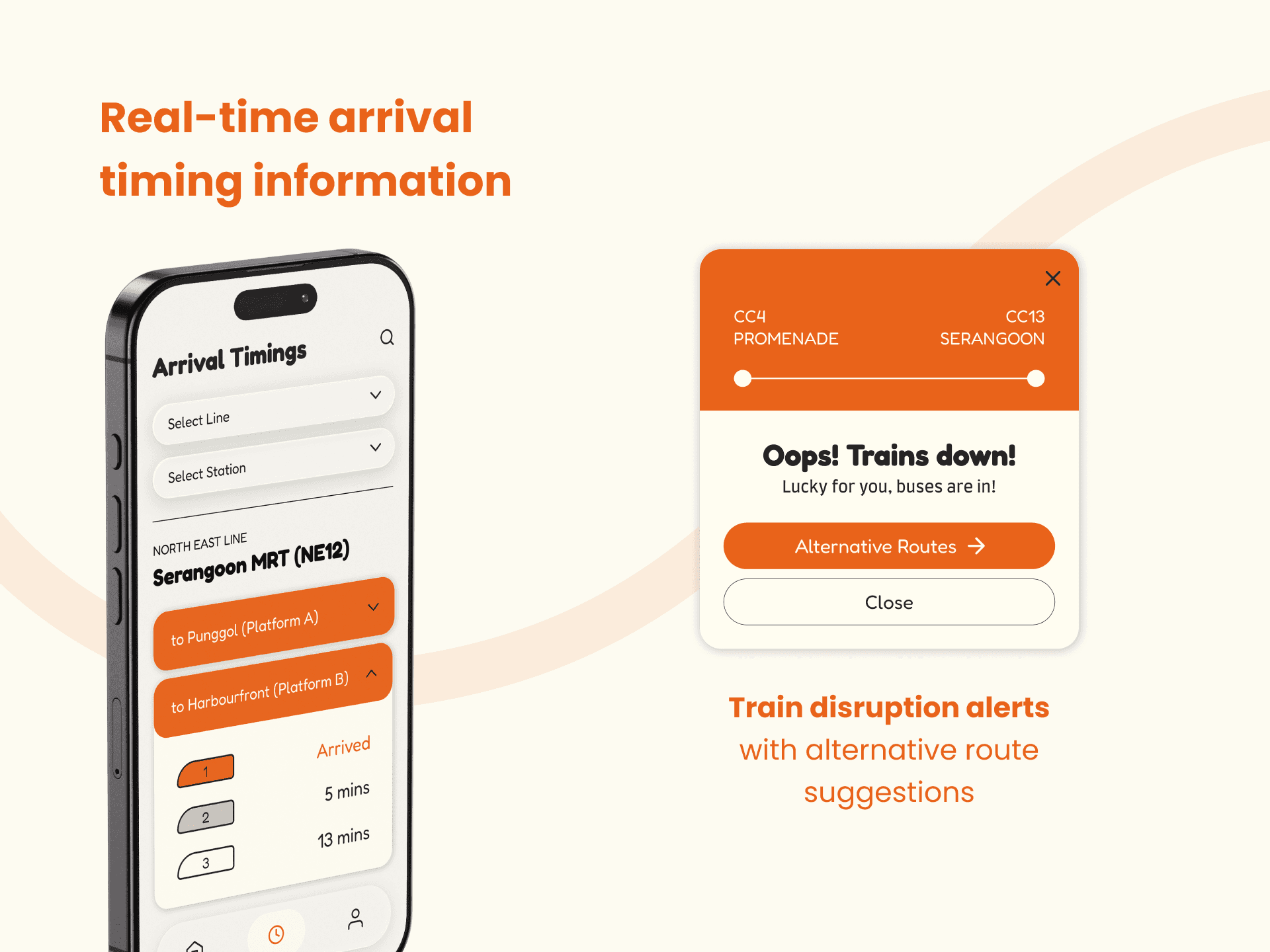
The project was driven by common commuting behaviours and frustrations observed during daily travel. Rather than focusing solely on navigation, Choo explores moments that traditional transport apps often overlook—from deciding which carriage to board to responding to unexpected service disruptions.
These observations informed features that support decision-making before and during a journey, helping users adapt quickly to changing travel conditions.
Information at a Glance
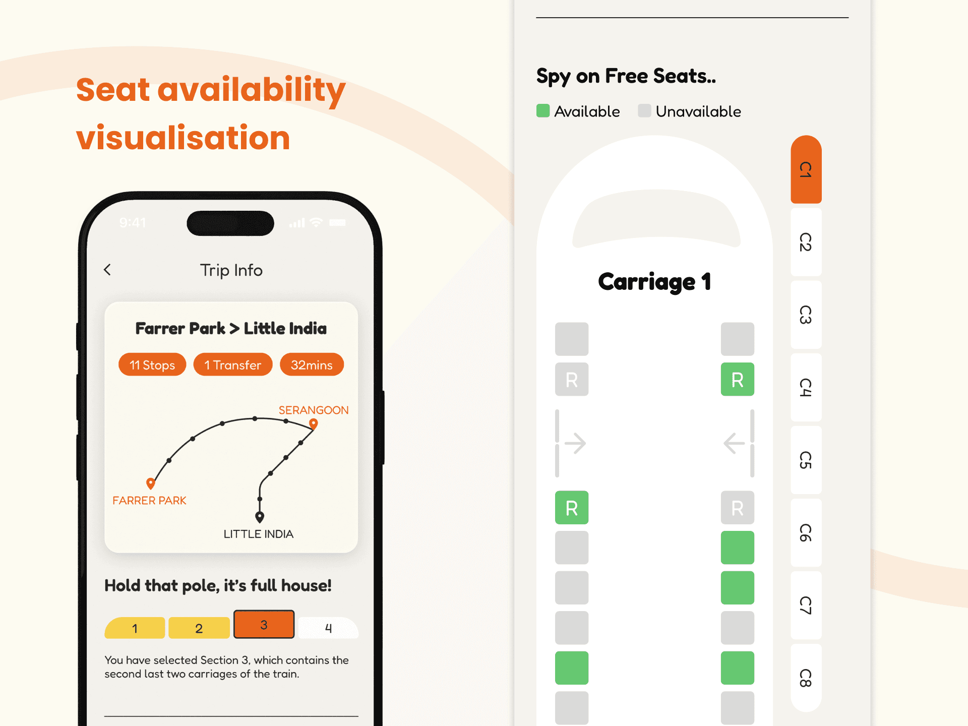
A key design principle throughout the project was reducing the effort required to interpret transport information.
Features such as carriage occupancy indicators, arrival timing displays, and disruption alerts were designed to communicate information visually and immediately. This allows commuters to make faster decisions without needing to navigate through multiple screens or dense datasets.

Exploring the Future of Commuting
Choo began as a branding project but evolved into a broader exploration of how digital products can improve everyday public transport experiences. The project demonstrates how branding, interaction design, and information design can work together to shape a more engaging commuting experience.
Where Branding Meets Utility
By combining a distinct brand personality with practical commuter tools, Choo shows that transport applications do not have to sacrifice warmth for functionality. Instead, utility and emotion can coexist to create experiences that people genuinely enjoy using.

